
Looking for help with your SEO?
- Keen to work with SEO professionals?
- Seeking a great return on your investment?
- Ready to accelerate your SEO?
- Wanting to partner with a cutting edge SEO team?
- Are you too busy running your business to do SEO?
- Ready to work with one of Australia’s most reputable and trustworthy agencies?
What will SEO do for your business?
Traffic
Leads
User Experience
Meet Some of Our Partners

We originally contacted TheOnlineCo. as our site needed SEO work. Rich has done a great job on this. His changes are starting to ‘wash thru’ google and we are starting to see the results. This work is currently ongoing. TheOnlineCo. has also (for a few months) overhauled our existing Ads campaign to bring it up to current practice with improved results.
Phil Callaghan
Owner, Loadshift

Evan Graham
Managing Director, Limcora

A great mix of up the minute use of technology so that we are seen in all the right places with a good old-fashioned marketing strategy that ensures all the activity is underpinned by careful thought. You are also super friendly and responsive, which makes dealing with you a pleasure. Thanks guys and well done!
Dr. Paul Donovan
The Change Company
SEO Case Studies – SEO Strategies that Work!
SEO is a complex undertaking with several potential strategies to focus on. Each business is different from all others. Your business may have many competitors – locally, nationally or worldwide. Not all SEO strategies will work equally for all businesses.
Sometimes a focus on building local landing pages is the best way to bring in that valuable local traffic. Another site may fare better with a focus on high quality blog article writing and content creation.
We’ve seen that most sites see substantial SEO benefits after technical issues have been addressed. Site re-structuring / siloing, speeding up page load speeds, fixing bad / inefficient coding, integration of schema microdata, etc. all have strong SEO benefits.
Below are some examples of our successful SEO work.
OUR SEO CASE STUDIES
This client has an eCommerce store with hundreds of products that were setup with a site structure that was not optimised for SEO. Although the products had been ‘categorised’, they all sat under the common ‘/shop/’ slug in the URL.
After implementation of our unique SEO optimised site structure, we saw a dramatic increase in organic visits to their website and also an increase in goal completions.
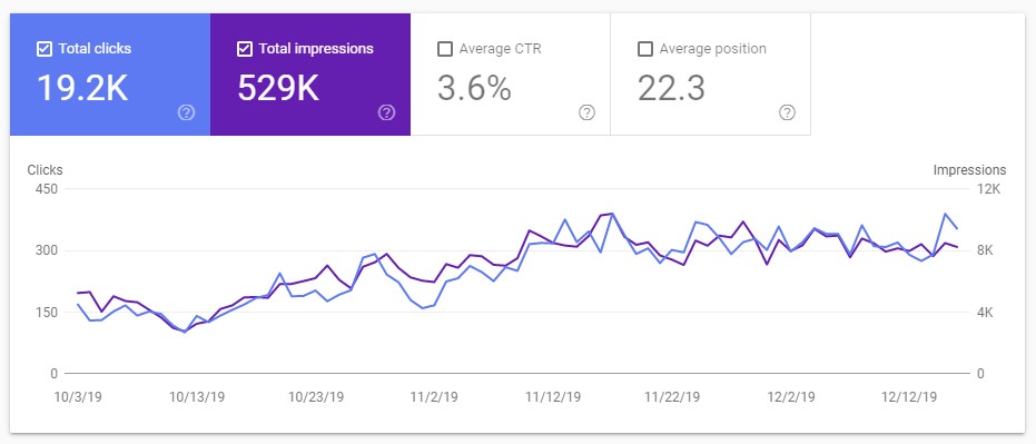
The SEO optimised site structure went live on the site October 15, 2019. As a result, you can see a steep and steady rise in organic traffic and impressions from that point on. (Click on the 1st image for a detailed graph)
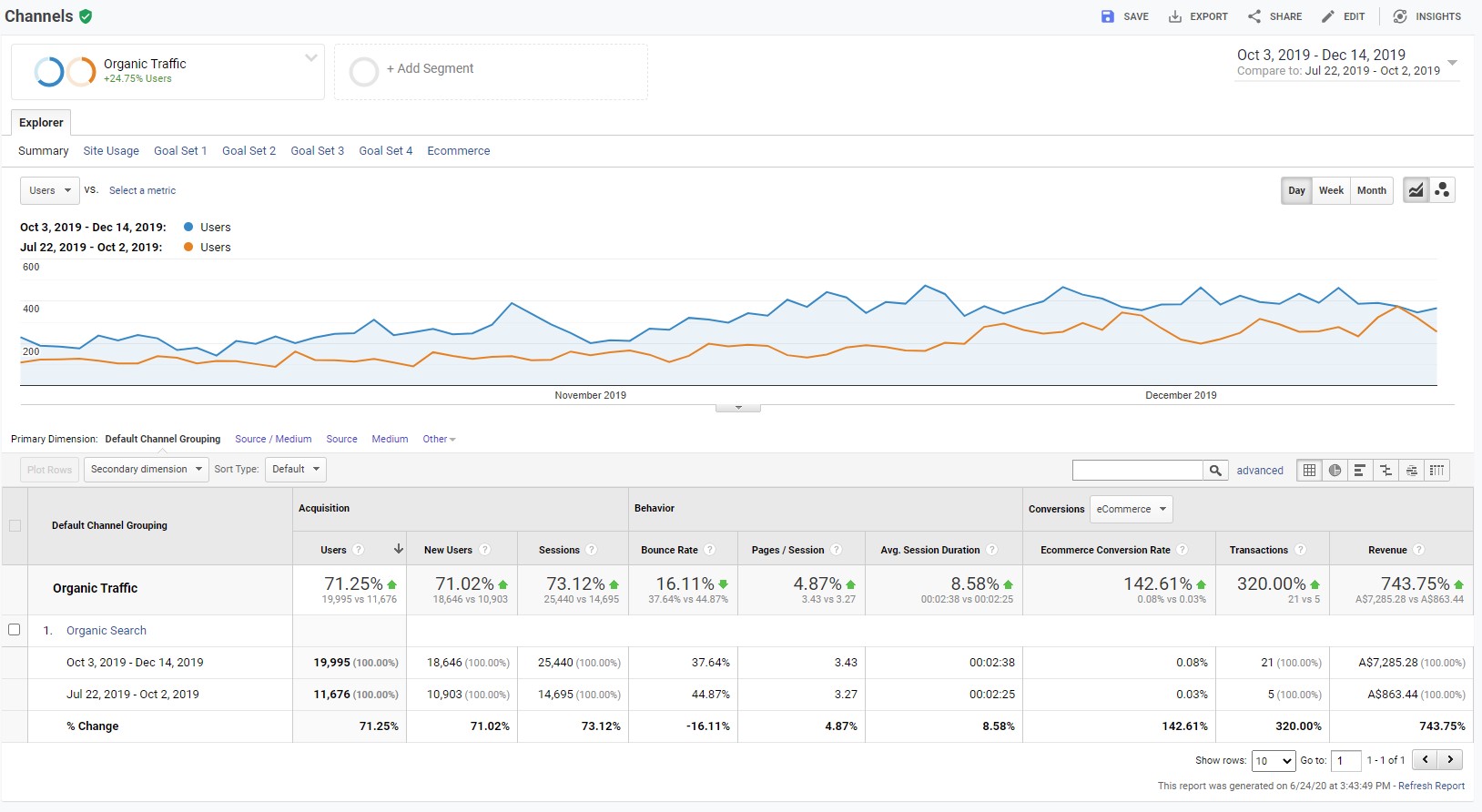
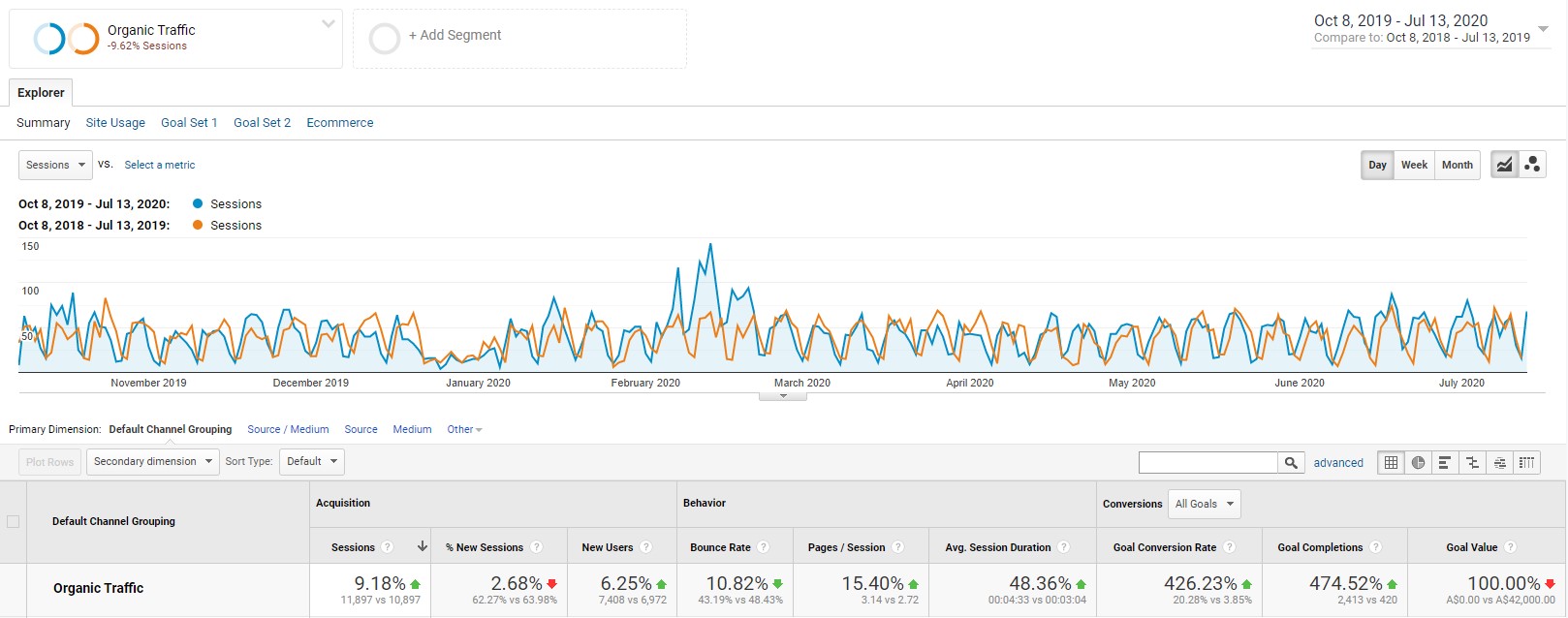
To further illustrate the improved organic performance after implementation of the SEO optimised site structure, this graph from Analytics shows a 71% increase in organic traffic when compared to the previous period of the same length. There was also a 142% increase in eCommerce interactions and a 743% increase in revenue! (Click on the 2nd image for a detailed graph)
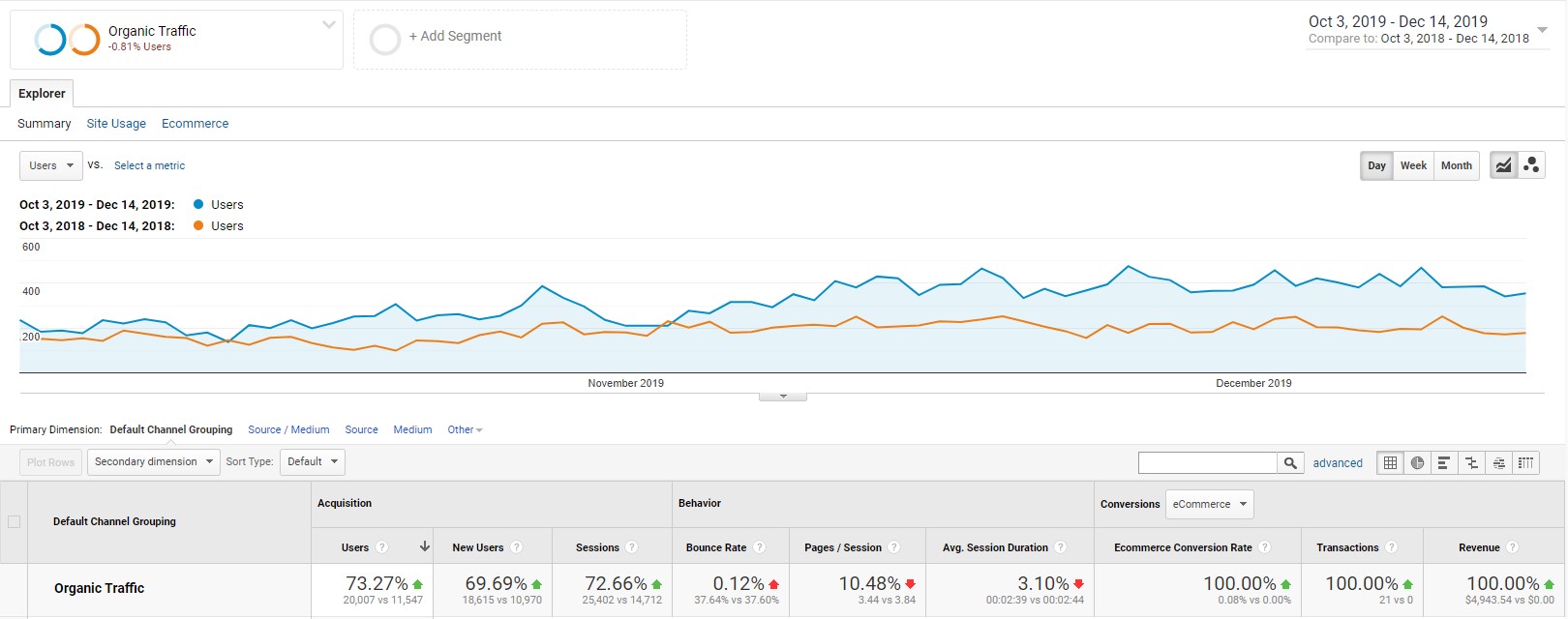
The 3rd image shows amazing organic SEO growth comparisons year on year.
We had been pursuing a strong content creation SEO strategy for this client which included:
- Reviewing old blog articles and consolidating out-dated and / or redundant content
- Re-launching & re-optimising old content with updated information and improved layouts / user experience
- Writing 2 new optimised articles per month using our unique method to target Featured Snippets on Google
As a result, we saw some stunning improvements.
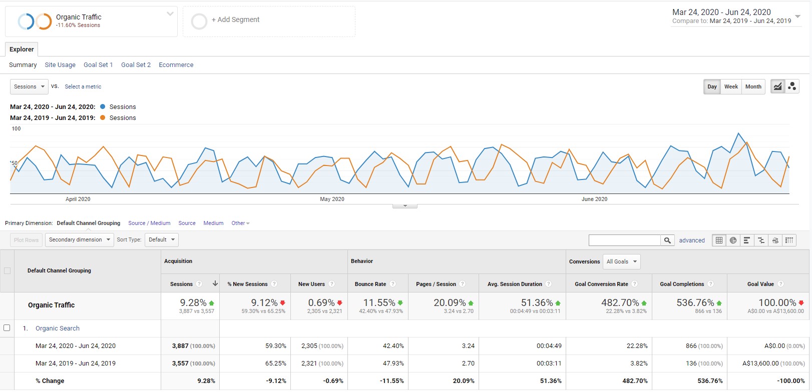
The first graphic (click to view) shows that results have been amazing with a 25% increase in organic traffic when comparing the 3 months between March 24, 2020 – June 23, 2020 to the same period in 2019. There was a stunning 8200% increase in organic goal completions as well!
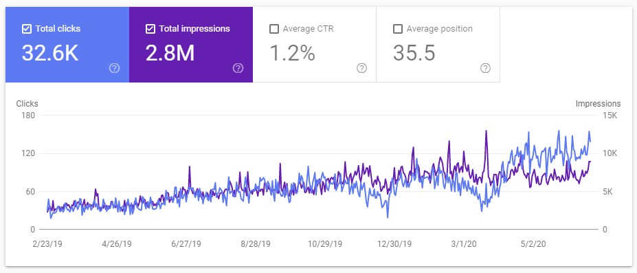
You can see in the second graphic from Search Console clearly shows a drastic increase in organic clicks and impressions when comparing a 3 month period in 2020 vs the same period in 2019.
The last graphic shows improvements over a 16 month period. You can see the dip in traffic during the COVID-19 shutdown and then a drastic rebound in April, 2020.
We saw a big increase in Google choosing our articles as Featured Snippet answers to questions (there’s no graph for that, or we’d show it here!). It is our belief that in April, 2020 Google gave more authority to our client’s site. This was due to the quality of the content we produced in combination with more social shares and backlinks generated from that content.
It should also be noted that we had implemented an SEO optimised / siloed site structure for this client in late-2018 which helped produce a good result.


This client had a website that we had been doing SEO work on for a while. The company went from being Australia-based to wishing for a global presence. They changed their domain from a ‘.com.au’ to ‘.global’ in late 2019.
To make this switch successfully, we worked to ensure that all of the titles and meta descriptions we had put into place were copied over to the corresponding pages on the new site. We also ensured that pages / URLs + from the old domain and website were redirected to the relevant URLs on the new domain and website.
The old website was using a CMS that was challenging to work with and we advised the client to rebuild the website using WordPress. This way we could implement an optimised site structure and work more effectively on SEO.
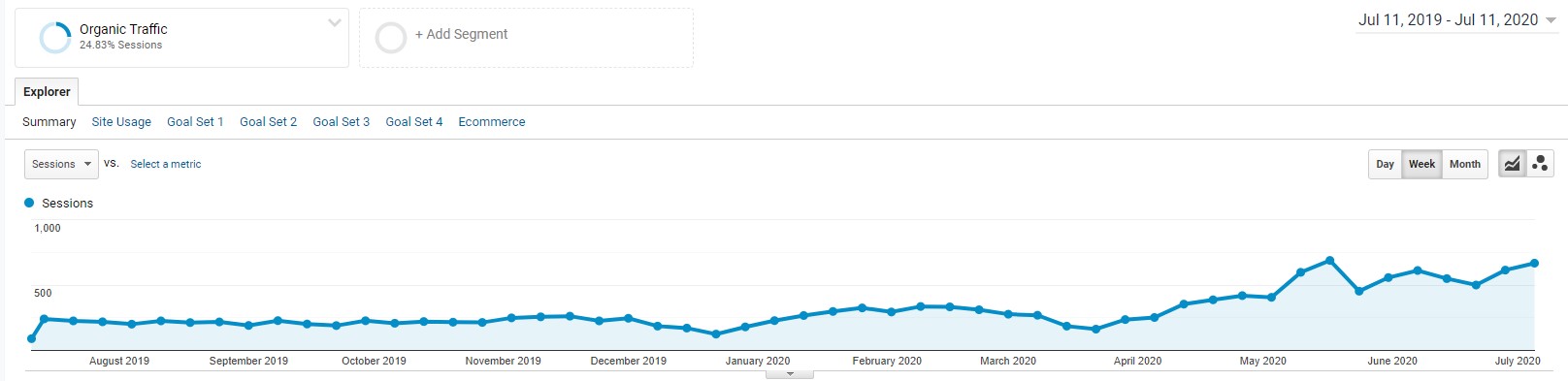
In the first graphic (click to view) we can see that after the new site / domain went live, there was no dip in traffic (after October 8, 2019). Over time we saw a 9% increase in organic traffic. There was a huge 475% increase in organic goal completions as well. You can see that the bounce rate also fell back nearly 11% and the session duration increased by nearly 50%.
The 2nd graphic shows similar stats when comparing a recent 3 month period to the same 3 month period in the previous year. A 9% increase in organic visits and 536% increase in organic goal completions. Bounce rate also fell back and session duration also improved.
UX is Important for SEO
Bounce rate and session duration are a testament to the importance of User Experience (UX) to SEO. The new website delivered the information in a more visually appealing format + the new site structure helped site visitors navigate more easily. An improved site structure also provided more clarity to Google around the different topics of the website. This resulted in better ranking for terms in the search results.
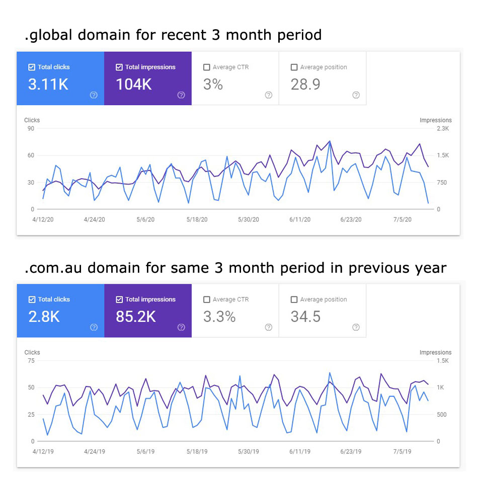
The 3rd graphic shows the organic results from a recent 3 month period for the .global domain and compares them to the results from the same period in the previous for the .com.au domain.
Much like case study # 2, we had been pursuing a strong content creation SEO strategy for this client.
Many blog articles had been previously written that had similar or outdated content. Our strategy was to consolidate the similar content to fewer pages – down to one page where possible. We also worked on updates to old content to reflect current data and information.
An important part of this work was to improve the User Experience (UX) on older content and re-launch old articles we had improved. We did this in coordination with Social Media announcements of each ‘new’ article. ‘Social Shares’ appear to have driven many new visits to the site which Google considers for SEO. Pages or articles with high popularity on Social Media platforms like Facebook, Instagram or LinkedIn rank higher in search results. These may be ‘nofollow’ links which prevent your page from getting ‘link juice' from the Social Media site. However, Google pays attention and notices when an article is getting a lot of visits and shares and will reward those that stand out.
We also wrote 1 – 2 new articles per month that were written to target Featured Snippets on Google. This strategy was very successful! As a result, in mid-May we saw a dramatic and consistent increase in organic traffic from that point on. (click on the 1st graphic to see these stats pulled from Analytics)
The second graphic shows a 211% increase in organic traffic when comparing the last 3 months to the same three months in the previous year. You can also see a 142% increase in organic impressions.

What Our Clients Have To Say
Rated 5 out of 5 stars based on 60 customer reviews.


Recent ‘SEO’ Articles:

Keyword Strategy Made Easy
A keyword strategy is crucial for businesses looking to improve their online presence, reach their target audience, and achieve their marketing goals. However, it can be complex and time-consuming. Why…

The 4 Stages of the SEO Exploration Process| TheOnlineCo.
A Rock-Solid Plan. SEO is an essential component of digital marketing, helping your clients find you in search engines like Google and Bing. At first, SEO can seem overwhelming, and…

Keyword Strategy Made Easy

Keyword Cannibalisation – What is it and does it affect your page rankings?
There are a lot of misconceptions when it comes to keyword cannibalisation. Some SEOs claim that it doesn’t exist, which only adds to the confusion and creates more myths. Keyword…
Podcast
3 Tools To Keep People On Your Website Longer
Is your website telling people to bugger off? Is it clear exactly what it is that you do? If not, perhaps your site is telling people to go elsewhere.
7 SEO Action Items To Do Today
Is SEO a mystery? Need to know which SEO tasks you should be doing? Find out what you can do today, to improve your site’s SEO!
4 Stages of the SEO Exploration Process
If your digital marketing isn’t working, this is for you. In this episode, we talk about an effective digital marketing strategy.
Keyword Strategy Made Easy
Do you want to learn about the importance of Keyword Strategy and why it’s necessary? Have a listen to our latest podcast to deepen your understanding.